Following in the steps of New York Fashion Week, we’re excited to share home decor inspo with Pantone Color Institute’s top 10 color palette for 2024. The latest color trends will find themselves paired nicely with the 5 classic neutrals that have also been selected to influence design in the coming year. Let’s look at what can be done…
Meet the Colors
We love to see the way colors shift over time–that’s what makes each year’s palette a new adventure. Which versions of color will we see? What is the message sent with the unveiling of the palette? This year’s colors invite you into a world of optimism, feeling freedom to create and personalize your world.
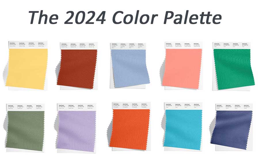
Along with these vibrant shades, you can find solace in the peaceful vibes brought forth with the neutral palette.

We love what we’re seeing with this year’s neutrals! No longer exclusive of one another, grays and browns are side-by-side, capable of being used in spaces together or alone complemented with colors.
Just Add Color
Many of us find it easy to use neutrals in design. They offer a soft atmosphere, but these hues can also leave you wanting more. More individual style, more personality, more life. The best way to do that is to introduce small amounts and see how it makes you feel. When you start small, with accents, you can find the perfect balance of style.
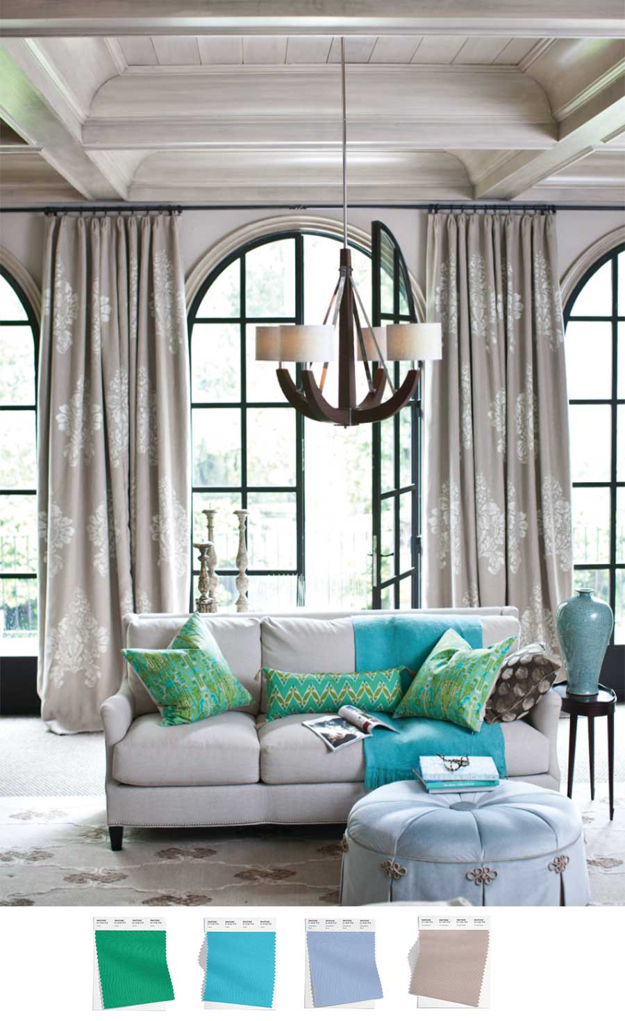
Which Colors Go Together?
While you need to follow your own senses to choose which colors you like together, there are a couple of rules you can look to when choosing. The first one tells us that pairing “opposing” colors (from the color wheel) will offer standout design. This means they contrast each other. Opposing colors are those such as orange & blue, yellow & purple, or red & green. They might not sound design-worthy before you see them together. Let’s explore the color pairing of blue and orange in this home office…
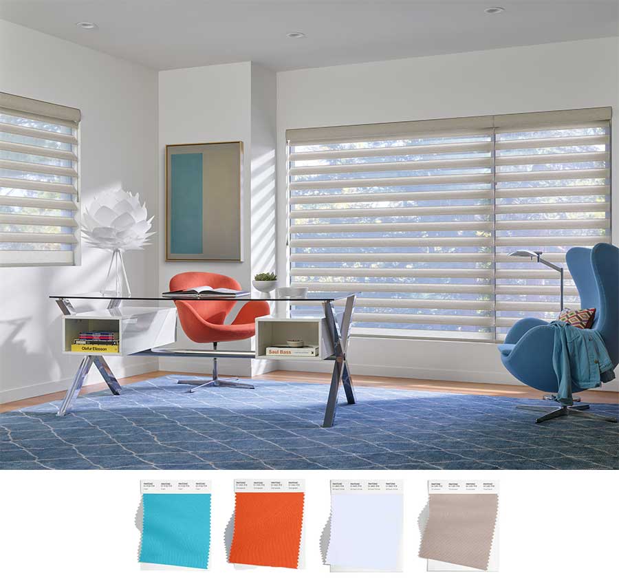
You might not love the idea of blue and orange, but these versions of color–in vibrant turquoise and muted blues, accented with orange, fall into that group. With opposing colors in home design, typically one holds the majority of the space, while the other is a bold accent. The homeowners chose a beige-inspired set of window coverings as a calm backdrop for this colorful space. Pirouette shades offer their own design accent, capable of adding dimension and light to the space with vanes that fold in place and reveal the landscape.
The other rule you can look to uses colors that are next to each other on the color wheel. Called analogous colors, they are known to create a smoother vibe, capable of calming the senses.
Make a Design Statement
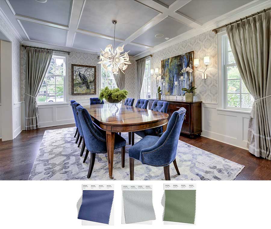
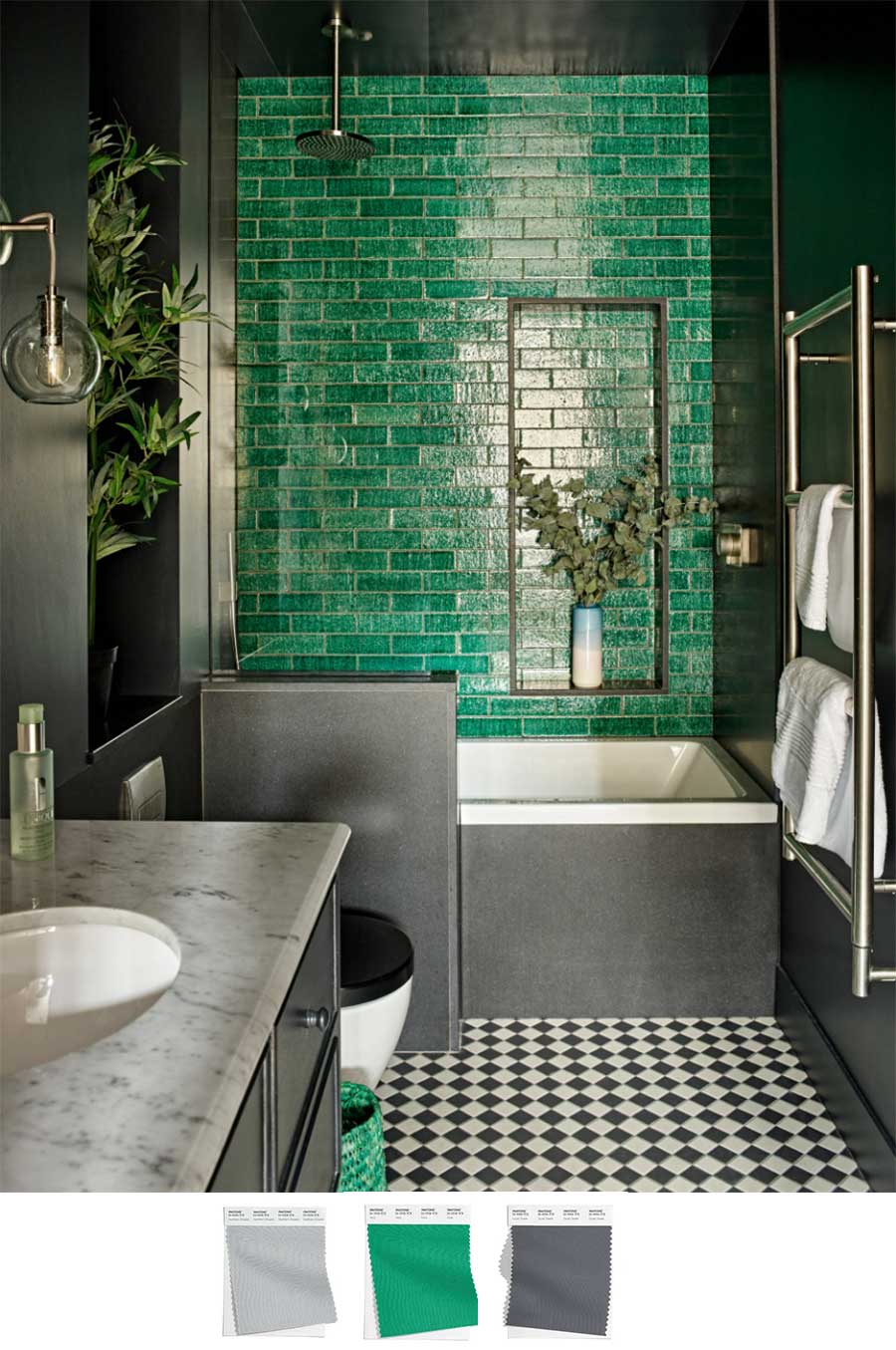
If it’s a statement color you’re after, sometimes it’s better if the color stands out in bold design, surrounded by neutrals, like the gray walls and black and white flooring. This dark bathroom was enhanced immediately with the introduction of the mint green tiles.
Create a Personal Sanctuary
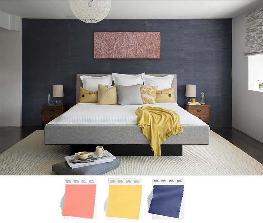
What matters most in design is your happiness. Your home should be your sanctuary. No matter whether you love this year’s palette, or you’re more partial to another, the latest color trends are here to bring inspiring ideas. Make it your own with an alluring backdrop, beautiful accent pieces and other elements that surround you with decor that creates a special space in your eyes.
Our team, at Austin Window Fashions, would love to help you design a space you love. Window coverings can play a huge part in the style and function of your home. The colors and patterns play to the style, while the operating features help create an atmosphere where you can enjoy your home to its full potential. Get in touch with us for your free in-home consultation.


