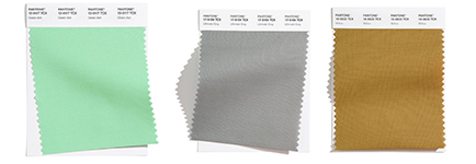
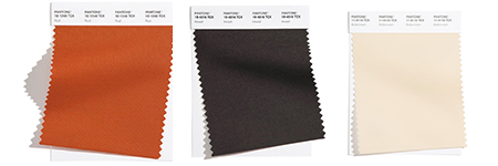
Decorating your home and refreshing different spaces throughout the years can be such a fun project. But, if you don’t know exactly what look you want to go for, the endless options can be a little overwhelming. Pantone just released their color trends for 2021, and it’s the best place to begin when it comes to starting a new project around your home. There are ten color suggestions overall and then five neutrals to pair them with as well! We have chosen a few of our favorites to introduce you to.
The Heart of the Home
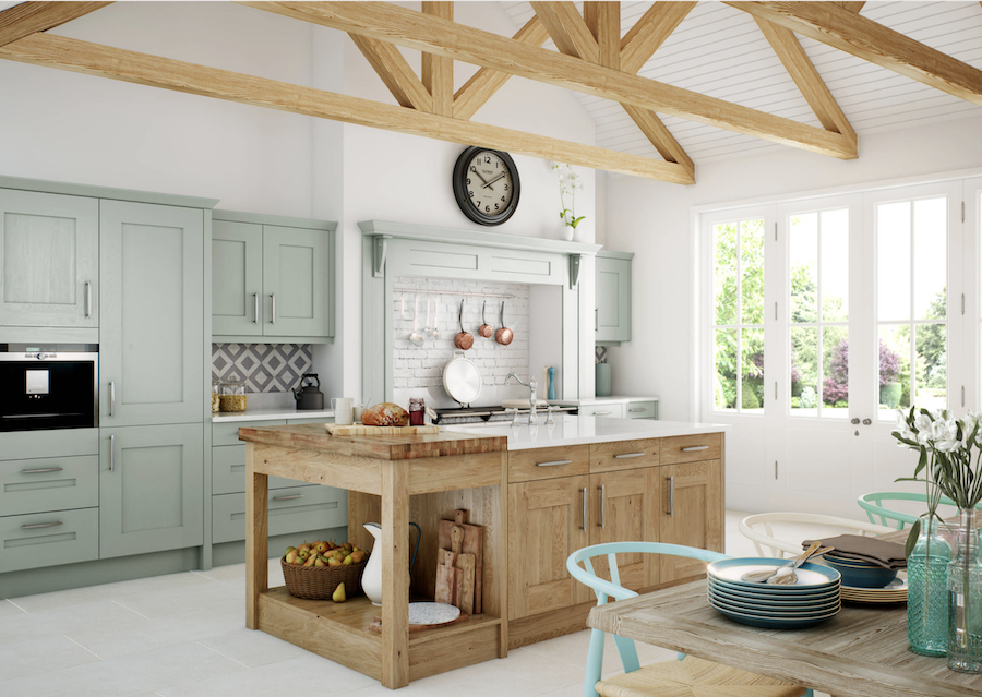
2020 has kept us all at home maybe a little more than we’re used to. This is why it’s extra important that your house feels like a home–a personal oasis for you and your family. For most, the heart of the home is their kitchen. It’s where family gathers around the table and engages in conversation all together, those are the little moments that mean so much! With all of the time spent in the kitchen, it’s important that you love the space. This welcoming kitchen shows off a way to add color while still keeping it warm and cozy with the natural wood tones.
Home Office, More Important than Ever
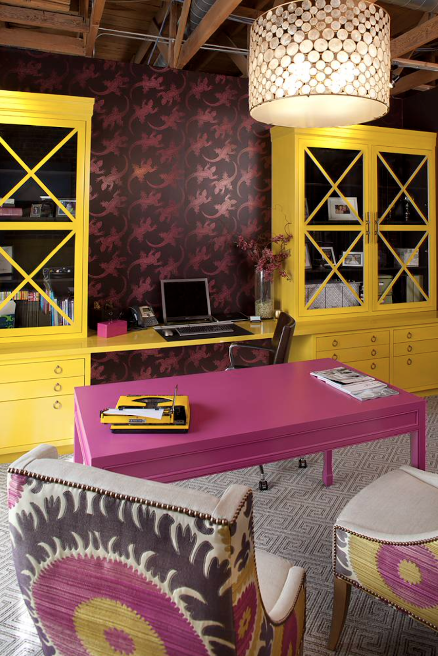
Whether you’ve always had a home office, or have recently converted part of your home to work as such, you’re probably spending a good amount of time there this year. Having an appealing workspace will keep you motivated, engaged, and working hard from clock-in until clock-out time. This home office below is perfect for working parents and virtual schooling kids! The contrasting colors add a whole new level of style and inspiration.

A Bit More Neutral, But Still a Pop of Color
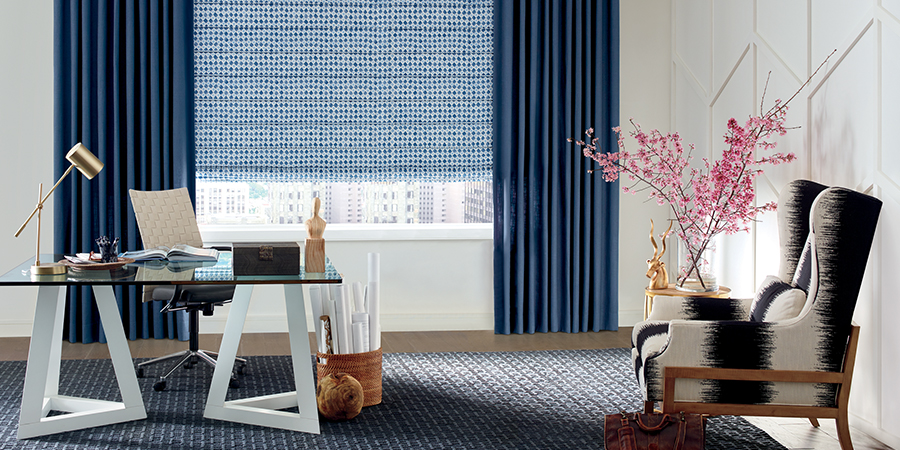
If the last color combo was a bit too bold for you, maybe going neutral and adding a pop of color is more your style! This room features blue, strategically using two different shades of blue to add even more style. The dark blue draperies add a level of sophistication while the lighter blue shades offer a soft look. Blue is almost always on the list of color trends, and just last December, we saw Classic Blue become the color of the year for 2020!


Smaller Gatherings, But Still Important
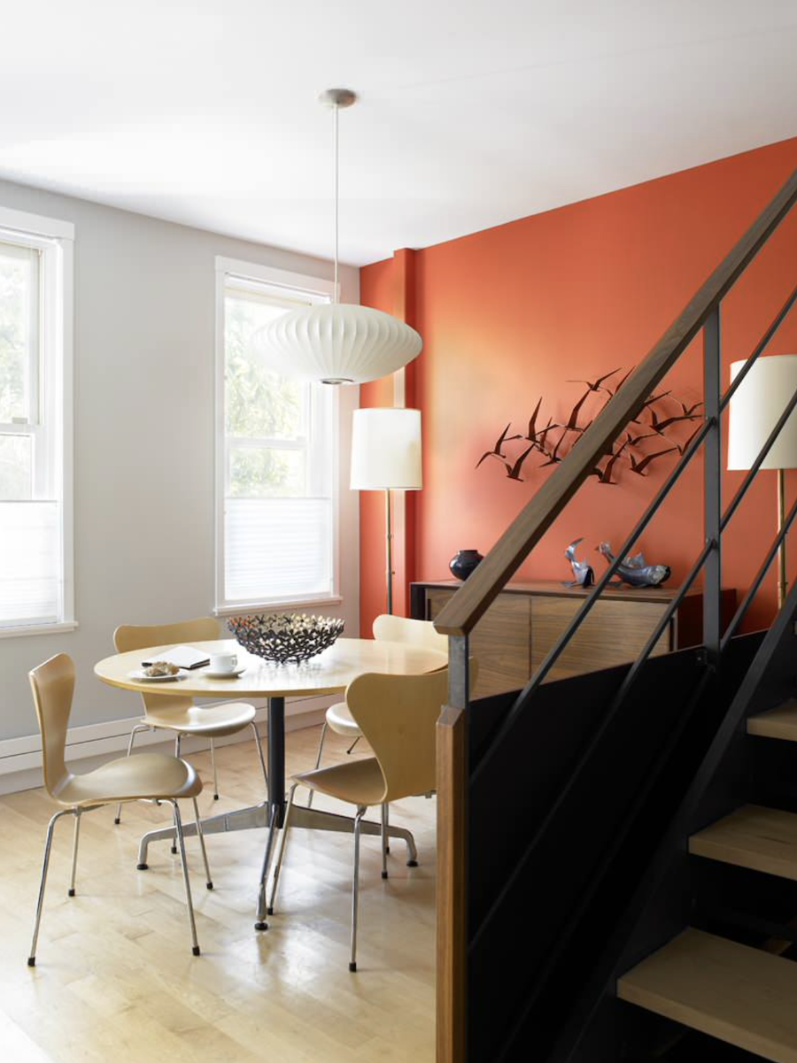
Thanksgiving may look a little different this year, a little smaller. Even with less people gathering and spending time joined together around the dining table, it’s still important. Even if it’s just your immediate family this year, that quality time is key! Adding this bright rust feature wall created a very inviting atmosphere to an otherwise neutral space.
Want to Add Some Color Trends to Your Home?
Even if your home is already fully decorated, if some of these colors spoke to you, there’s nothing standing in your way from switching up a room or two! We are loving the color pairings we’re seeing together this year. And even better, they offer stunning neutrals to help ground your spaces. If you’re looking for window treatments to add both function and style to your newly decorated spaces, our team is here to help! Contact Austin Window Fashions today for your FREE consultation.

